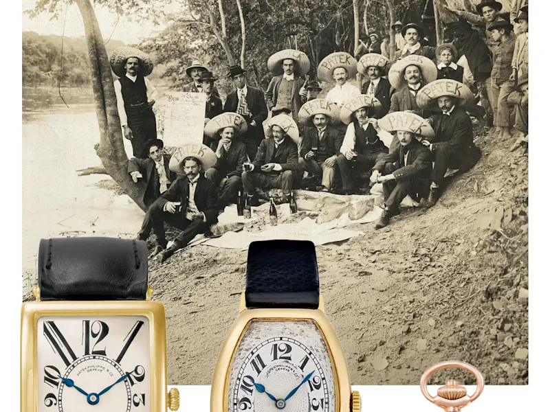
[001][11.06.26]
The 5070 and 5170 (or as we like to call them ‘the father’ and ‘the son’) represent two important milestones in Patek Philippe’s chronograph-making journey. But just how different are these two references, if at all?
Even with most of the fanfare reserved for the uppermost echelons of Patek Philippe’s complications department, the proverbial workhorse of any haute horlogerie brand worth its salt is the manually wound chronograph. Looking through that lineage, Patek Philippe boasts an impressive track record throughout the mid-century, but it is two transitional references, notable for marking the end of Patek’s partnership with Lémania, that we’re focusing on today.
The answer to the rhetorical question I proposed right at the outset is one we can answer straight away. The ref. 5070 and ref. 5170 are very different watches. Sure, they’re both twin-register, manually wound chronographs. Yet the respective period of Patek’s history each watch stems from is enough to make them distinct, and individually crucial to understanding the brand’s story.
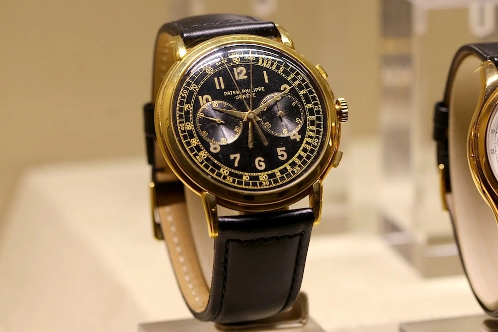
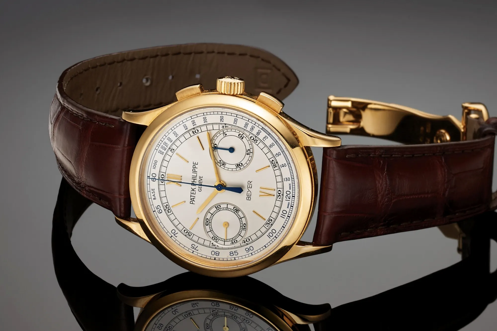
The Patek Philippe ref. 5070 was introduced in 1988 as a follow-up to what remains one of the most revered chronographs ever produced – the ref. 1463 “Tasti Tondi”. Needless to say, it would take quite a watch to fill those shoes, especially after a three-decade absence of such a quintessential complication from a ‘Holy Trinity’ manufacturer. Its double-stepped bezel and caseback, and single-stepped lugs (reminiscent of those found on the ref. 2499) and the tachymeter scale wouldn’t have been too out of the ordinary – all of these design codes have long been Patek’s bread and butter. What was wildly different is that the 5070 was effectively Patek’s largest wristwatch since the ‘50s, with an aesthetic heavily inspired by the 46mm-wide, ref. 2512 – a (possibly) unique design, noted for integrating a split-seconds chronograph.
Fast-forward to 2005, and we see Patek lifting the covers off the ref. 5959. This diminutive split-seconds monopusher measured just 33mm, but signalled the beginning of a new era of in-house chronograph production. The 5170 would arrive five years later, in some ways proposing a more un-trendy design: smaller diameter, a less complicated case construction, and plenty of improvements that would make it a worthy successor.
In short? The 5170 was the first manually wound chronograph, made in-house with strong mainstream appeal, that had been produced by Patek. To be sure, it may have trailed the Datograph by over a decade. But this was Patek Philippe after all – a name worth waiting for.
Looking at these two watches side-by-side, and without an exhaustive knowledge of Patek Philippe’s references, I wouldn’t be surprised if you couldn’t pick the more recent release of the two. In our view that’s a very good thing, and speaks to the Patek propensity for design languages that are unified by classicism and timeless aesthetic codes.
A closer look does however reveal some key differences that can point to the chronology of the duo’s release. The easiest way to tell apart Patek’s Lémania-based chronographs from their in-house counterparts is the positioning of the sub-dials. Where the Lémania timepieces feature registers which bisect the dial (horizontally and precisely), all the CH27-suffixed models see these shift a few degrees south.
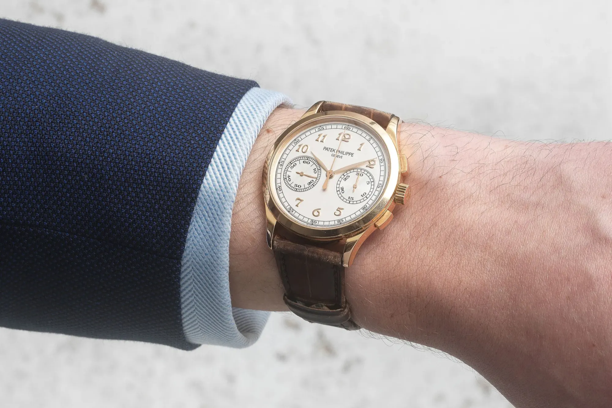
In comparison with its spiritual predecessor, the 2512, the 5070 was pretty much a scaled-down, simplified variation. Crucially, Patek removed the split-seconds functionality and sized the case down to 42mm. At 11.6mm in height, the large diameter made for a very flat-wearing case, standing out amongst other neo-vintage contemporaries of the period. Where the 5070 swung wildly in diameter increase – especially compared to the ~35mm Tasti Tondi that preceded it – the 5170 brought things back to Goldilocks-esque proportions, with a total diameter of 39mm.
Interestingly enough, in either case, few collectors have voiced disapproval for Patek’s choice of sizing over the decades. The 5070 has been lauded as ‘ahead of its time’ rather than oversized, while the 5170 is appreciated for walking a tricky middle ground – where size and scale are tempered by excellent proportions.
The storied past of Patek and Lémania has been the subject of so many articles that there isn’t actually a ton more to add. Nevertheless, the 5070 figures crucially in that relationship, as it was the final reference, alongside the revered 5970, to field a Lémania-based calibre. Here, you could find it in its simplest form: with the distinctive, hand-beveled chronograph bridges unobstructed by calendar or split-second modules. One drawback however was the 27-70’s diameter: some 15mm smaller than the case around it (and obviously so, thanks to the use of a proportionately sized transparent caseback).
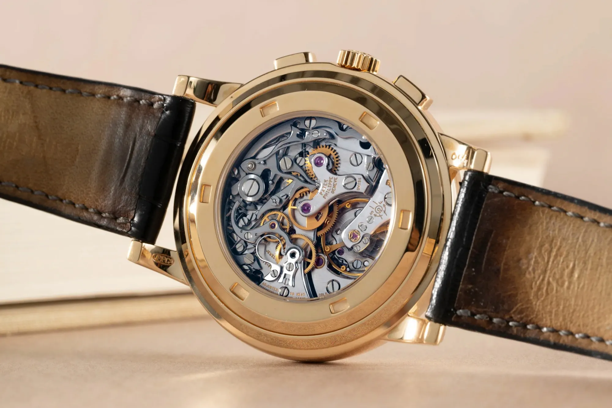
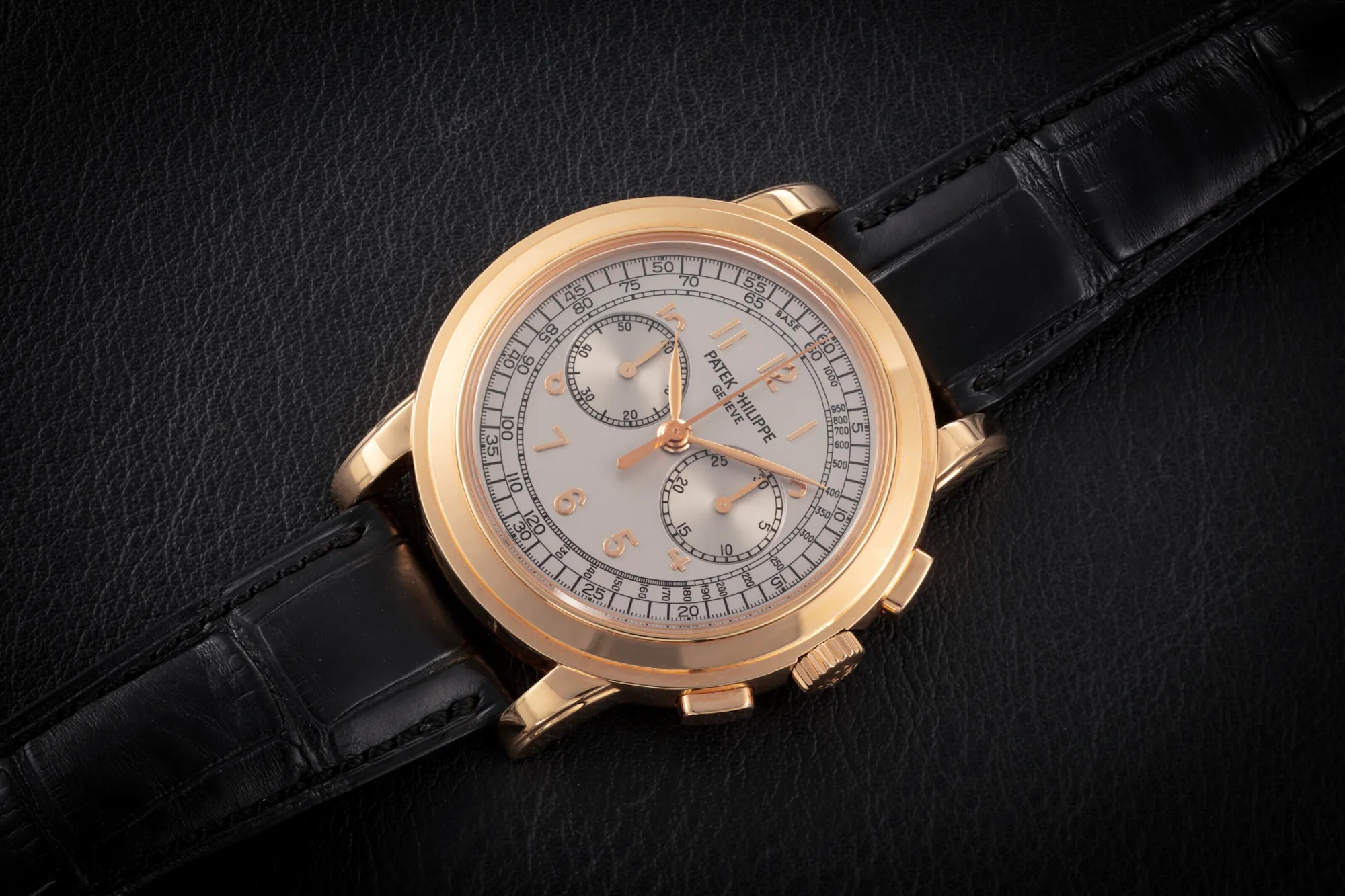
Fortunately, with a 39mm case size and larger CH 29-535 PS calibre, the 5170 doesn’t suffer from the same visual quirk of its older sibling. The two-register dial layout bears a superficial resemblance to the look of the 5070, but leaving our discussion there wouldn’t be fair. The 5170 introduced instantaneous jumping chronograph minutes and hacking seconds, alongside a 4Hz beat rate and a 65-hour power reserve. Those aren’t quite groundbreaking stats today, but such performance was downright impressive 15 years ago.
Famously (if you’re a movement nerd like me), Patek patented its intermediate wheel teeth for smoother engagement, leading to a reduction in the amount of perceptible ‘jitter’ wearers feel when resetting the chronograph. Compared to the Lémania, the tactile sensation when you press the pushers here is a lot lighter.
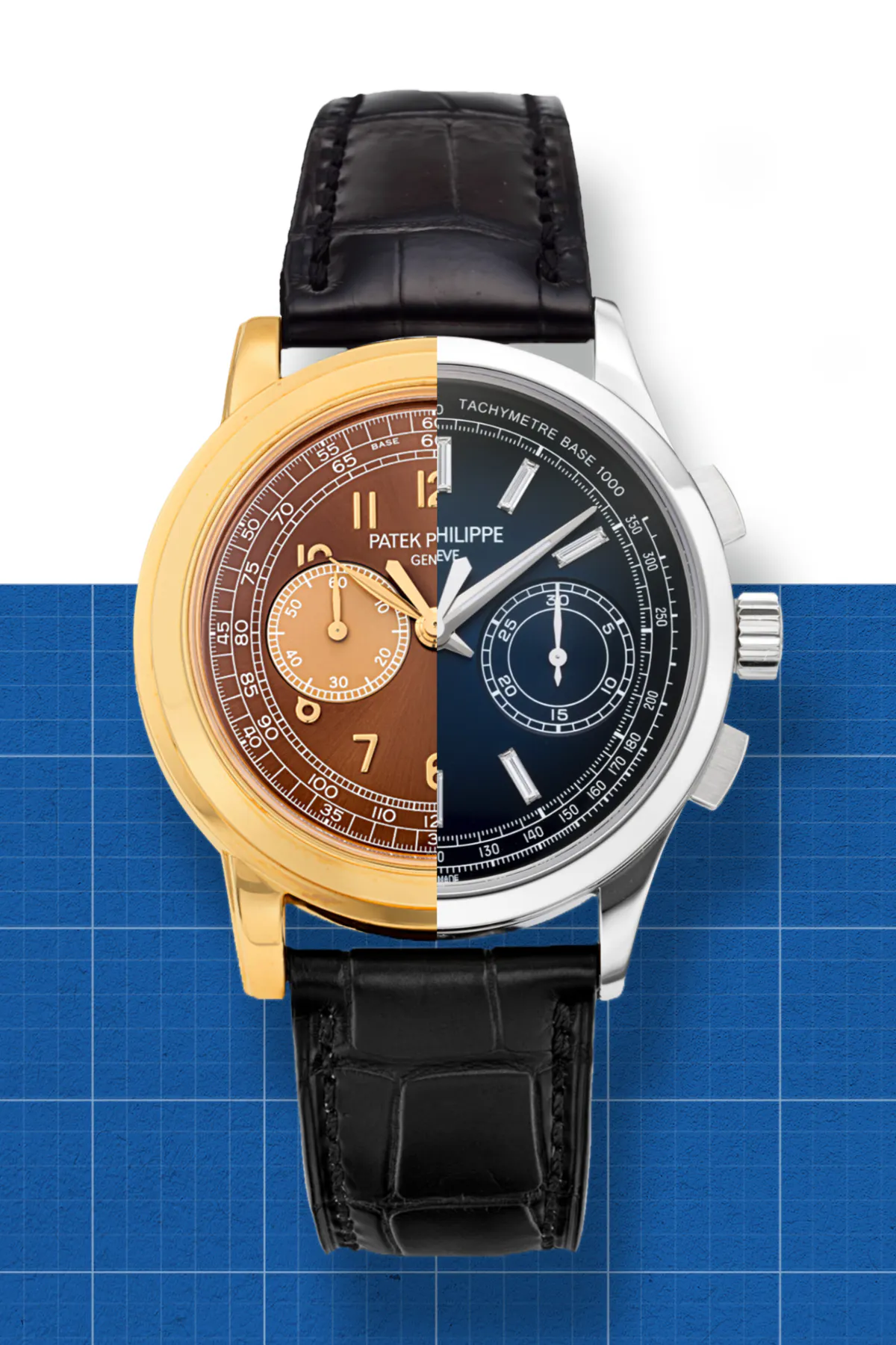
Expanding on what I mentioned earlier about sub-dial positioning, it’s now time to take a closer look at the two references’ dials. On the surface, the 5070 and 5170 are fairly similar – both being twin-register chronographs leaning towards what most watch collectors will describe as the ‘dressier’ end of the scale. But on the 5170, the subtle height drop of the registers makes for a significant aesthetic improvement – especially if you’re the kind of person who can’t stand seeing lovely, applied numerals obscured as they are in the design of the 5070. Furthermore, this left more room on the upper portion of the 5170’s dial, which allowed Patek to enlarge and better position their branding.
Curiously, despite the 5170 losing several millimetres of visual real estate thanks to the reduction in case size, its dial gets to breathe much more easily. This is mainly thanks to the slimmed down and consolidated style of the watch’s outer track, instead of wide tachymeter and chemin de fer styles. Not only do the dials appear more legible, the hands are also upsized, reaching further towards the rehaut.
It’s worth also exploring the range of dials across these two models. Beginning with the 5070, this reference exists in four known variations, all utilizing the same slightly strabismic bi-compax layout in which the subdials sit close to the central pinion:
Yellow gold 5070s came with a gilt black dial; the 5070G had blackened white gold appliques on a silvery-white backdrop; the 5070R got matching dial furniture on a metallic silver dial, and perhaps best known of all is the platinum and royal blue combination. The 1998 edition of Patek’s own in-house magazine promised annual production would reach 250 at most per year, though precise numbers can be difficult to verify. That said, the 11-year production run suggests no more than 3,000 pieces being made total.
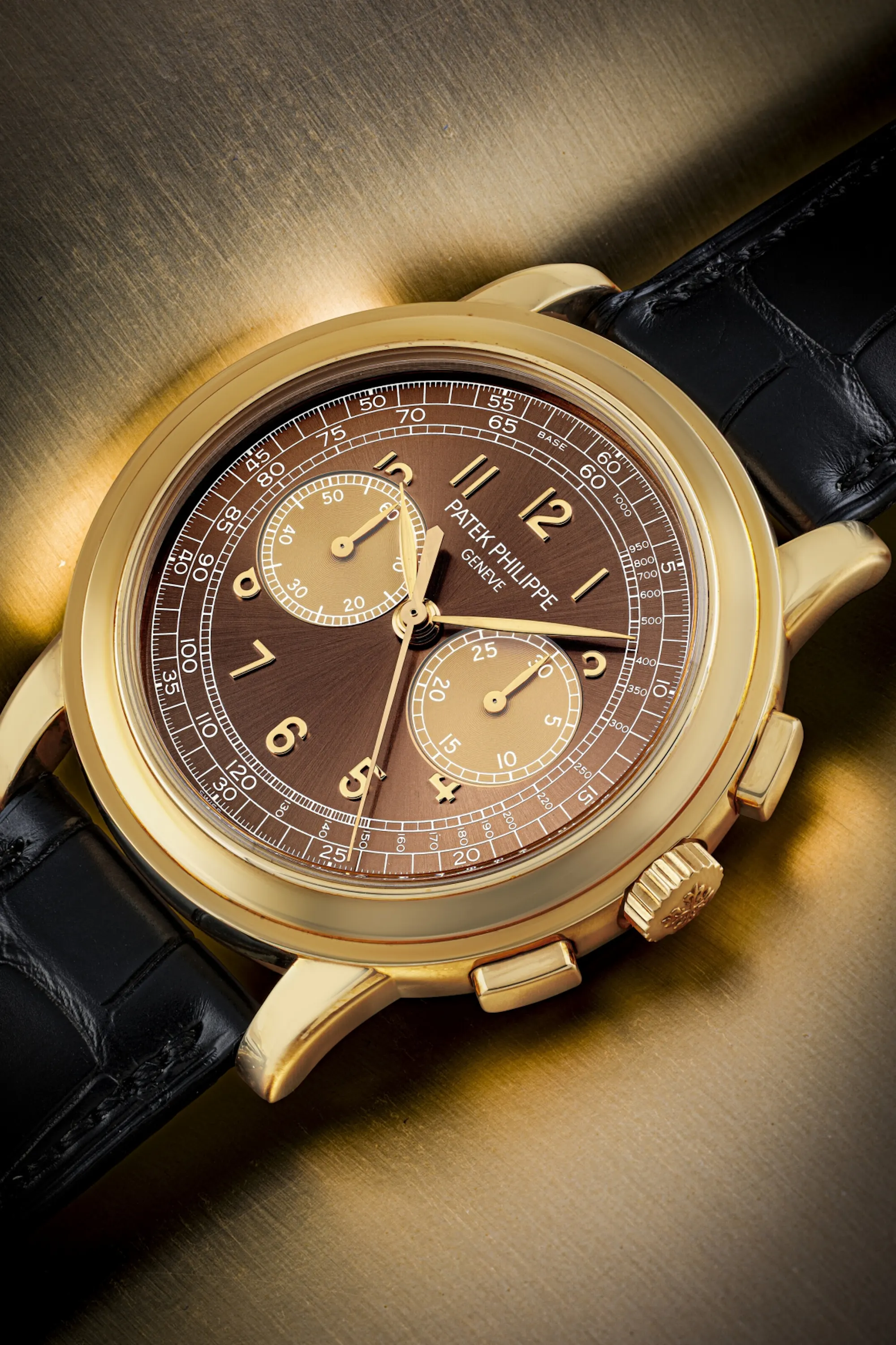
Remember however that this is Patek Philippe we’re talking about, which means the 5070 had no shortage of special editions and pièce unique specimens. As this isn’t a full-blown guide to collecting the 5070, I’ll just point out the four Saatchi editions that are among the most revered LEs. They were made in just a handful of pieces in each metal, featuring a brown-dialled 5070J, salmon 5070G, black 5070R, and a slightly lighter blue 5070P.
If you enjoy options, however, the 5170 is likely going to be the reference for you. See our chronological breakdown below:
The original reference, the 5170J, was first introduced in 2010 – complete with Roman numerals for the 6 and 12 o’clock indices, and batons everywhere else. One defining characteristic of these earliest 5170s was the chapter ring, which is invariably decorated with a pulsometer scale. This would remain the sole configuration in the collection until the arrival of the 5170G in 2013, which swapped the combination of batons and Romans for a full scale of Breguet numerals. To match this variation’s white gold case, the tone of the dial also shifted from a faint champagne to opaline white.
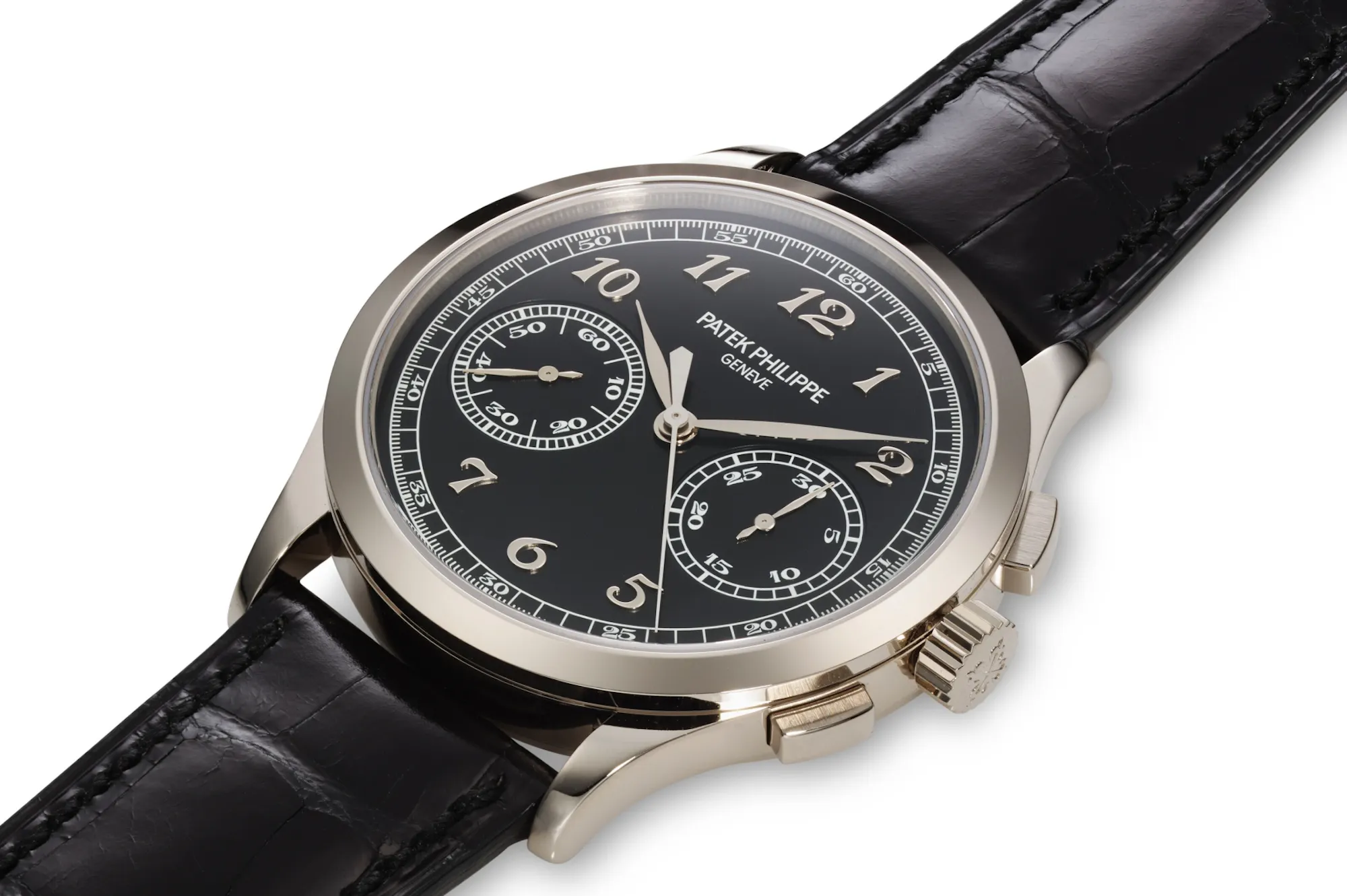
A second white gold 5170G was added two years later, this time with a black dial and no pulsometer scale. I’m personally of the mind that this is among the most elegant chronograph layouts Patek has executed in its recent history: the enlarged, dropped subdials and Breguet numerals work really well against a monochrome backdrop.
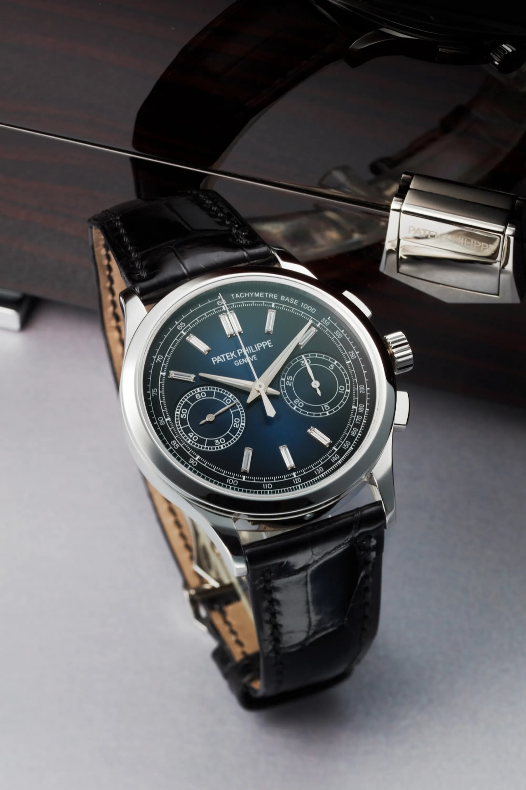
Baselworld 2016 saw two further pulsometer-free 5170s (2016 - 2018) join the fray – for the first time in rose gold, with black and champagne silver dials. But the high watermark of the entire reference came one year with the 5170P. This platinum iteration of the 5170 reintroduced a tachymetre scale to the dial, combining it with a blue-black gradient effect and baguette hour markers (doubled up at 12 o’clock). Quite a fitting way to conclude a landmark collection.